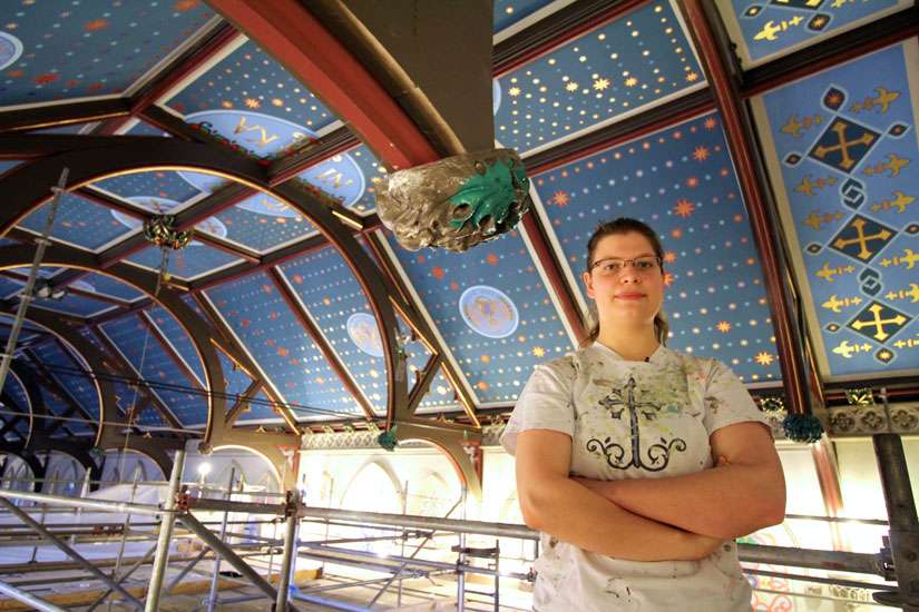
That was what the original builders of St. Michael’s Cathedral aimed for when work began in the 1840s. The ceiling, a blue background for the sky dotted with stars, fit perfectly with the Gothic style of the church.
But over the years the curved ceiling running west to east, from above the choir loft to above the altar, became a contrast in styles and colours. Instead of a consistent theme a giant box, reflecting the Romanesque style of architecture, was added. On it there were scenes from the life of Christ and diamond, triangular and rectangular pieces of reds, greens and yellow.
This overbearing complexity was the opposite of what Sviat Makarenko believes creates true beauty: simplicity.
“Simplicity is the hardest because you to have to get it exactly right in order for the simplicity to work,” said Makarenko, whose firm, Ecclesiastical Art & Design of Yonkers, N.Y., won the contract to restore the ceiling to its former glory. “There is no waste in it. Take a very good poem. You can have just a simple couplet but, of course, the work required to achieve that couplet takes a lifetime.”
Makarenko, 63, first learned iconography from his father, an immigrant from the Ukraine. He then studied under masters of the art who had fled the communists to practise their work and faith in the United States.
Iconography taught him how to get to the essence things, so as to “delve into a deeper level of communication.” It also taught him how to use colour to inspire and lift viewers out of themselves, just as prayer is supposed to do.
Makarenko eventually broadened his company into all kinds of church art including stained glass and such elements as the tiles on the church floor.
The new ceiling at St. Michael’s, he said, reflects this simplicity, in the sense that at first blush it is easy to grasp: A beautiful blue background with stars that seem to flicker and move. On closer inspection, though, it is clear this simple ceiling comes by way of myriad details that were painstakingly created.
Once renovations began, it was decided that the original blue with stars would be restored but with a custom blended blue never used before by the company on any other project. The idea was to not only restore architectural purity but to make the ceiling an esthetic and spiritual focus
“I think in the Gothic, with the tradition of having the blue with the stars is also this allusion to the heavens,” said Ruslana Makarenko, the 26-year-old daughter of the father and daughter team.
The new ceiling consists of panels with each of the thousands of stars hand painted with gold leaf. But even that detail has sub details.
If Ruslana — who began studying with her father when she was eight years old — were to take parishioners on a tour of her company’s handiwork, she would make sure that all noticed the small details of the massive ceiling that make it come alive.
“We wanted to make it dynamic, to give a sense of movement,” she said.
In that spirit the angled panels that make up the base of the ceiling force the eye to keep looking up. At the top the flat panels are smaller.
“We even changed the size of the stars to not all the same size,” she said. “So the angled panels have larger stars and the small flat panels have smaller stars to almost make it look like it is getting higher and you’re moving into the depths of the heavens.”


