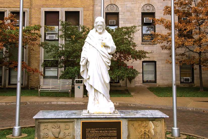
Before the rumours were staunched, a petition on the change.org web site collected 3,350 signatures demanding the 95-year-old hospital retain crosses visible to drivers on the Gardiner Expressway just west of downtown Toronto.
A friendly chat with the anonymous author of the petition persuaded him to shut it down.
“There has never been nor will there be an intent of the organization to remove the crosses from the building,” St. Joe’s VP Mike Heenan told The Catholic Register.
The Catholic hospital, founded by the Congregation of St. Joseph sisters in 1921, did roll out a new logo last month. Unlike the old logo, the new one is all text with no cross planted between the words “Health Centre” and “Toronto.” The refreshed corporate image for the hospital is a result of a 2014 strategic planning process and 2015 consultations with the surrounding community. It also arrives just in time for a $70-million fundraising campaign by the St. Joseph’s Health Centre Foundation to fund improvements to the aging building and update its diagnostic equipment.
But going all text has nothing to do with any effort to de-emphasize the hospital’s Catholic roots.
“That’s who we are, and we want to always highlight that we’re connected to the sisters,” said Heenan.
The new design elevates and highlights the words “St. Joseph’s” specifically to make that connection with the hospital’s founders. The new logo also highlights the “T” and the “O” in St. Joseph’s to call attention to the connection between the hospital and the city it serves. The word Toronto is also highlighted.
This is not the first time in the hospital’s history it’s had an all text logo, Heenan said.
Before going ahead with the logo change, St. Joe’s looked at other Catholic hospitals in Toronto and across southern Ontario. Almost all of the Catholic hospitals sport cleaner, clearer text-based logos. St. Joseph’s Healthcare Hamilton inserts a very small cross between “Healthcare” and “Hamilton.” St. Joseph’s Health Care London features a budding leaf. In Toronto, both St. Michael’s and Providence Healthcare have word-only logos.
Rebranding hospitals is serious business, said Heenan.
“At the end of the day, while you say we may not be selling soap, patients do have choices. Patients can go 15 kilometres in any direction and choose other locations for care,” he said. “Part of this is to not just tell the St. Joe’s story but instill a sense of confidence about the care we provide — to promote the patient experience and work with patients on the information they can receive before they visit the health centre.”


